PROMO CREATIVE
THE INTENTION
Draw in the customer, increase revenue, and ensure they have a streamline customer journey.
THE TASK
A homepage takeover designed for Black Friday and Cyber Monday, with banners featuring throughout the category pages, mobile nav imagery and badging across the product and category pages.
THE HURDLES
- Trying to present two different promotions to the customer without confusing them.
- Coming up with an aesthetically pleasing width for the svgs. This was complex as they varied by language and each device.
THE SOLUTION
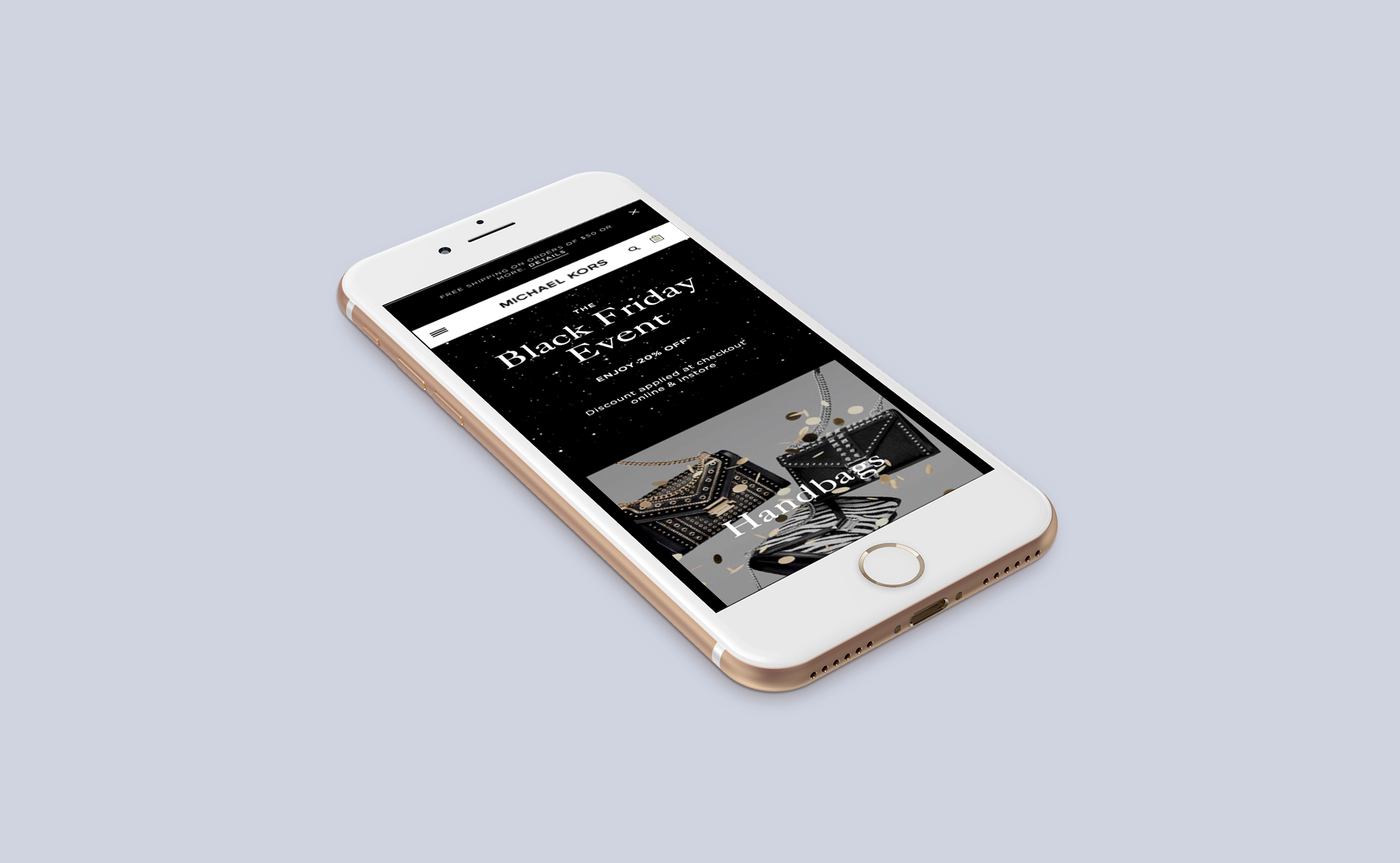
I came up with the concept of using a starry night sky. It reflected Black Friday without being something we had already done and we wanted something with a hint of sparkle without being actual glitter. I tied in all the creative by giving the homepage a black background in which the plate fades seamlessly into.


THE INTENTION
Draw in the customer, increase revenue, and ensure they have a streamline customer journey.
THE TASK
Come up with a concept for sale that aligns with the Spring/Summer campaign shoots. Carry this through to a homepage banner, top banners on category pages, solus emails, and email banners across full price emails. Update these for each of the four sale phases.
THE HURDLES
- Trying to find a plate that tied into the campaign imagery when it was all shot in studio against a flat coloured background.
- Ensuring each locale gets the correct sale creative when all 50 have different launch and dates.
THE SOLUTION
Creating plates on Photoshop that depicted rolled card and paper textures, with gradients were the light would have hit it. This tied into the campaign imagery by portraying how the edges of the coloramas would have looked on the shoots. Consistent typographic lockups but changing the colour and texture out for each phase meant the sale was familiar to the customer but clearly showed a fresh new twist of the promotion to discourage sale fatigue.


Heading